A visual exploration of the Nobel Prize history
15 August, 2013 - 3 min read
After some time in mind, finally I have got some free time to spend creating a web page to show the information related to Nobel Prizes.
After discovering Nobel Prize web site offers an API to query both prizes and laureates from the beginning of the history of the prizes I was thinking in the creating of a kind of dynamic infography to allow explore the information in a useful and simplified way.
A short description of the application
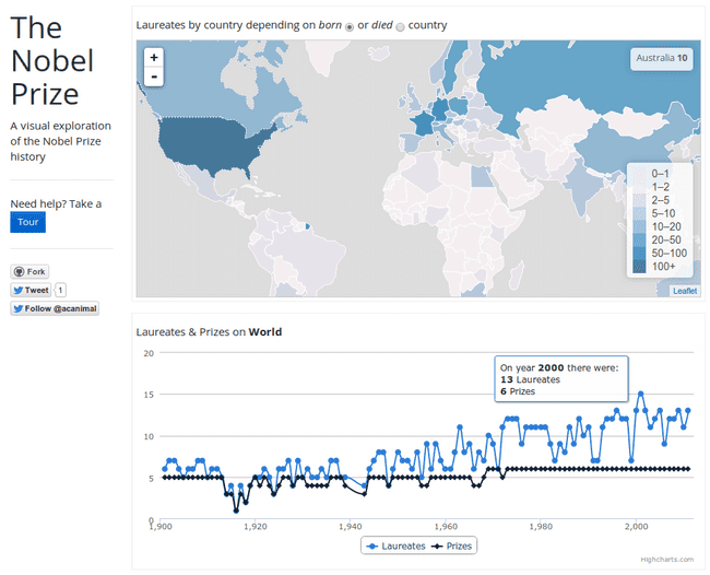
The goal of the application is to show the Nobel Prizes data in useful ways in addition to search laureates by filtering data. The application offers:
- Colorpleth map: to see the number of laureates depending on the born or died country
- Line chart, to show the number of prizes and laureates by year
- Column chart, to show prizes and laureates grouped by category and
- Column chart, to show how prizes are shared by laureates
- Table, with laureates information (prize, year, category and motivation)
- A nice tour to know how to work with the application
To filter information and reduce the amount of data in the laureates table, the idea is to go from top to bottom and select on each chart the desired information. This way, each time we select a country in the colorpleth map the rest of the charts and the laureates table are updated to show information related with that country. If we select a year in the line chart, the chart above it are updated to reflect the information for that year.
How was it made?
Once I had the idea I started exploring libraries to create the charts.
Initially I though in D3, which is an awesome and super powerful library, both to create the map and the charts. Unfortunately, D3 is too much low level library for my needs and I require to create my own little chart libraries to reuse components.
For the colorpleth map, after some exercises using D3 (from this nice post) I finally decide to make use of Leaflet, which is tiny JavaScript library specifically designed to make simple maps. Also I found a nice tutorial to create a colorpleth map that was a plus in my decision.
Next was to explore D3 derived chart libraries, like dc.js, nvd3 or morris.js. After some test I discard them because lake of need requirements or documentation to use them properly. The final choice was HighCharts, a really powerful library to create almost any kind of chart. It is really easy to create charts, add tooltips, control selection, etc and has a free license for non commercial apps.
Finally, I was thinking in the bottom laureates table. Initially I code it using a standard HTML table and adding and removing entries using jQuery. But after some headaches I change to DataTables which is a really powerful tool to create tables both from table tag or an external content loaded via AJAX.
Contribute
The Nobel Prize app is a simply exercise to test some different tools and try to produce a useful utility.
As always you can find the code at my GitHub account and contribute with improvements. A demo is also available at: http://www.acuriousanimal.com/nobel-prize-explorer
